Contents
"Events" widget
You can use the Events widget to get analytics based on SQL queries.
When creating this widget, you must specify the settings described in the tables below.
Tab 
The following table lists the settings on the tab.
Description of parameters
Setting |
Description |
|---|---|
Graph |
Graph type. The following graph types are available:
|
Format |
Data display format: Absolute values or Relative values, %. The setting is available for a Stacked bar chart. If you select the Absolute values format, the heights of the bars correspond to the sum of the values of the measured indicator. If you select the Relative values, % format, all bars have the same height of 100%, and the relative heights of colored zones on the bars correspond to the ratios of indicator values. By default, Absolute values is selected. |
Tenant |
The tenant for which data is displayed in the widget. You can select multiple tenants. By default, data is displayed for tenants selected in layout settings. |
Time period |
Period for which data is displayed in the widget. The default is As layout, meaning that data is displayed for the period selected for the layout. You can also specify a period for the widget in one of the following ways:
For details, see the Configuring a period subsection below. |
Show data for previous period |
Enable the display of data for two periods at the same time: for the current period and for the previous period. When using a Stacked bar chart, the Show data for previous period setting is taken into account if the query contains standard aliases: |
Storage |
Storage that is searched for events. The list displays the available spaces. You can select only one storage, but you can select one or more spaces. The values in the Storage field are independent of the selected tenants in the Tenant field. The field displays storages and spaces, like in the Events section. If the user does not have access rights to one or more spaces of the storage, the widget cannot display information; the user cannot edit the widget, but can duplicate the widget using the Duplicate button. Duplication does not depend on access rights to spaces. If a template is duplicated in widgets that have spaces specified that are not accessible to the user, the value in the Storage field is reset. Such widgets display an error: Access denied (Operation returns no results because of allowed and selected event spaces). To save the template, you need to specify spaces in widgets. In widgets that have spaces that are accessible to the user, the value of the Storage field is not reset and is saved when the template is duplicated. If the user's email address is included in the list of recipients of the scheduled report, the user gets the full version of the report, regardless of which spaces are accessible. |
SQL query field ( |
Query for filtering and searching for events manually. You can create a query in Builder by clicking For detailed information on creating an SQL query in the query constructor, see below. The following limitations apply:
|
 )
)How to create a query in Builder
To create a query in Builder:
- Specify the values of the following parameters:
- SELECT—event fields that should be returned. The number of available fields depends on the selected graph type.
- In the drop-down list on the left, select the event fields for which you want to display data in the widget.
- The middle field displays what the selected field is used for in the widget: metric or value.
If you selected the Table graph type, in the middle fields, you must specify column names using ANSII-ASCII characters.
- In the drop-down list on the right, you can select an operation to be performed on the data:
- count—event count. This operation is available only for the ID event field. Used by default for line charts, pie charts, bar charts, and counters. This is the only option for date histogram.
- max is the maximum value of the event field from the event selection.
- min is the minimum value of the event field from the event selection.
- avg is the average value of the event field from the event selection.
- sum is the sum of event field values from the event selection.
- SOURCE is the type of the data source. Only the events value is available for selection.
- WHERE—conditions for filtering events.
- In the drop-down list on the left, select the event field that you want to use for filtering.
- Select the necessary operator from the middle drop-down list. The available operators depend on the type of value of the selected event field.
- In the drop-down list on the right, enter the value of the condition. Depending on the selected type of field, you may have to manually enter the value, select it from the drop-down list, or select it on the calendar.
You can add search conditions by clicking Add condition or remove search conditions by clicking
 .
.You can also add groups of conditions by clicking Add group. By default, groups of conditions are added with the AND operator, but you can change the it if necessary. Available values: AND, OR, NOT. Group conditions are deleted using the Delete group button.
- GROUP BY—event fields or aliases to be used for grouping the returned data. This parameter is not available for Counter graph type.
- ORDER BY—columns used as the basis for sorting the returned data. This parameter is not available for the Date Histogram and Counter graph types.
- In the drop-down list to the left, select the value that will be used for sorting.
- Select the sort order from the drop-down list on the right: ASC for ascending, DESC for descending.
- For Table type graphs, you can add sorting conditions by clicking Add column.
- LIMIT is the maximum number of data points for the widget. This parameter is not available for the Date Histogram and Counter graph types.
- SELECT—event fields that should be returned. The number of available fields depends on the selected graph type.
- Click Apply.
Example of search conditions in the query builder
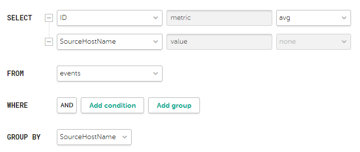
Search condition parameters for the widget showing average bytes received per host
Tab 
The following table lists the settings on the tab.
The tab is displayed if on the tab in the Graph field you have selected one of the following values: Bar chart, Line chart, Date Histogram.
Description of parameters
Setting |
Description |
|---|---|
Y-min and Y-max |
Scale of the Y axis. Negative values can be displayed on chart axes. This is due to the scaling of charts on the widget and can be fixed by setting zero as the minimum chart values instead of Auto. |
X-min and X-max |
Scale of the X axis. Negative values can be displayed on chart axes. This is due to the scaling of charts on the widget and can be fixed by setting zero as the minimum chart values instead of Auto. |
Line-width |
Width of the line on the graph. This field is displayed for the "Line chart" graph type. |
Point size |
Point size on the graph. This field is displayed for the "Line chart" graph type. |
Tab 
The following table lists the settings on the tab.
Description of parameters
Setting |
Description |
|---|---|
Name |
Name of the widget. |
Description |
Description of the widget. |
Color |
The color used for displaying the information:
This setting is available for graphs such as Bar chart, Counter, Line chart, Date Histogram. |
Horizontal |
Makes the histogram horizontal instead of vertical. When this option is enabled, when a widget displays a large amount of data, horizontal scrolling is not available and all available information is fit into the fixed size of the widget. If there is a lot of data to display, it is recommended to increase the widget size. |
Show total |
Shows sums total of the values. |
Show legend |
Displays a legend for the analytics. The toggle switch is turned on by default. |
Show nulls in legend |
Displays parameters with a null value in the legend for analytics. The toggle switch is turned off by default. |
Decimals |
Number of decimals to which the displayed value must be rounded off. |
Period segments length |
Duration of the segments into which you want to divide the period. Available for graphs of the Date Histogram type. |
Scale |
Scale for displaying data. Available for a Stacked bar chart. The following values are possible:
The default is Linear. |
"Active lists" widget
You can use the Active lists widget to get analytics based on SQL queries.
When creating this widget, you must specify the settings described in the tables below.
Tab
The following table lists the settings that must be specified on the tab.
Description of parameters
Setting |
Description |
|---|---|
Graph |
Graph type. The following graph types are available:
|
Tenant |
The tenant for which data is displayed in the widget. You can select multiple tenants. By default, data is displayed for tenants selected in layout settings. |
Correlator |
The name of the correlator that contains the active list for which you want to receive data. |
Active list |
The name of the active list for which you want to receive data. The same active list can be used by different correlators. However, a separate entity of the active list is created for each correlator. Therefore, the contents of the active lists used by different correlators differ even if the active lists have the same names and IDs. |
SQL query field |
This field lets you manually enter a query for filtering and searching active list data. The query structure is similar to that used in event search. When creating a query based on active lists, you must consider the following:
Special considerations apply when using aliases in SQL functions and SELECT, you can use double quotes and backticks: ", `. If you selected Counter as the graph type, aliases can contain Latin and Cyrillic characters, as well as spaces. When using spaces or Cyrillic, the alias must be enclosed in quotation marks: "An alias with a space", `Another alias`. When displaying data for the previous period, sorting by the count(ID) parameter may not work correctly. It is recommended to sort by the metric parameter. For example, SELECT count(ID) AS "metric", Name AS "value" FROM `events` GROUP BY Name ORDER BY metric ASC LIMIT 250. |
You can get the names of the tenants in the widget instead of their IDs.
Sample SQL queries for receiving analytics based on active lists:
|
Tab
The following table lists the settings that must be specified on the tab.
This tab is displayed if on the tab, in the Graph field, you have selected Bar chart.
Description of parameters
Settings |
Description |
|---|---|
Y-min and Y-max |
Scale of the Y axis. Negative values can be displayed on chart axes. This is due to the scaling of charts on the widget and can be fixed by setting zero as the minimum chart values instead of Auto. |
X-min and X-max |
Scale of the X axis. Negative values can be displayed on chart axes. This is due to the scaling of charts on the widget and can be fixed by setting zero as the minimum chart values instead of Auto. |
Tab
The following table lists the settings that must be specified on the tab.
Description of parameters
Setting |
Description |
|---|---|
Name |
Name of the widget. |
Description |
Description of the widget. |
Color |
The color used for displaying the information:
|
Horizontal |
Makes the histogram horizontal instead of vertical. When this setting is enabled, all available information is fitted into the configured widget size. If the amount of data is great, you can increase the size of the widget to display it optimally. |
Show total |
Shows sums total of the values. |
Show legend |
Displays a legend for the analytics. The toggle switch is turned on by default. |
Show nulls in legend |
Displays parameters with a null value in the legend for analytics. The toggle switch is turned off by default. |
"Context tables" widget
You can use the Context tables widget to get analytics based on SQL queries.
When creating this widget, you must specify the settings described in the tables below.
Tab
The following table lists the settings that must be specified on the tab.
Description of parameters
Setting |
Description |
|---|---|
Graph |
Graph type. The following graph types are available:
|
Tenant |
The tenant for which data is displayed in the widget. You can select multiple tenants. By default, data is displayed for tenants selected in layout settings. |
Correlator |
Name of the correlator that contains the context table for which you want to receive information. |
Context table |
Name of the context table for which you want to receive information. The same context table can be used in multiple correlators. However, a separate entity of the context table is created for each correlator. Therefore, the contents of the context tables used by different correlators are different even if the context tables have the same name and ID. |
SQL query field |
This field lets you manually enter a query for filtering and searching context table data. By default, for each widget type, the field contains a query that obtains the context table schema and the key by key fields. The query structure is similar to that used in event search. When creating a query based on context tables, you must consider the following:
Special considerations when using aliases in SQL functions and |
You can get the names of the tenants in the widget instead of their IDs.
Sample SQL queries for receiving analytics based on active lists:
|
Tab
The following table lists the settings that must be specified on the tab.
This tab is displayed if on the tab, in the Graph field, you have selected Bar chart.
Description of parameters
Setting |
Description |
|---|---|
Y-min and Y-max |
Scale of the Y axis. Negative values can be displayed on chart axes. This is due to the scaling of charts on the widget and can be fixed by setting zero as the minimum chart values instead of Auto. |
X-min and X-max |
Scale of the X axis. Negative values can be displayed on chart axes. This is due to the scaling of charts on the widget and can be fixed by setting zero as the minimum chart values instead of Auto. |
Tab
The following table lists the settings that must be specified on the tab.
Description of parameters
Settings |
Description |
|---|---|
Name |
Name of the widget. |
Description |
Description of the widget. |
Color |
The color used for displaying the information:
|
Horizontal |
Makes the histogram horizontal instead of vertical. When this setting is enabled, all available information is fitted into the configured widget size. If the amount of data is great, you can increase the size of the widget to display it optimally. |
Show total |
Shows sums total of the values. |
Show legend |
Displays a legend for the analytics. The toggle switch is turned on by default. |
Show nulls in legend |
Displays parameters with a null value in the legend for analytics. The toggle switch is turned off by default. |
"Assets" customized widget
You can use the Assets → Customized widget to get advanced asset analytics from processed events using the query builder. In the query, you must specify the asset field and the corresponding condition or set of conditions by which you want the assets to be counted (Y-axis). You can also specify one or more additional conditions (categories) to be used for comparing the number of assets for each field.
When creating the custom widget for assets, you must specify the settings described in the tables below.
Tab
The following table describes the settings on the tab.
Description of parameters
Setting |
Description |
|---|---|
Graph |
Graph type. The following graph types are available:
|
Format |
This setting is available for charts of the Stacked bar chart type. Data display format: Absolute values or Relative values, %. If you select the Absolute values format, the heights of the bars correspond to the sum of the values of the measured indicator. If you select the Relative values, % format, all bars have the same height of 100%, and the relative heights of colored zones on the bars correspond to the ratios of indicator values. By default, Absolute values is selected. |
Tenant |
The tenant for which data is displayed in the widget. You can select multiple tenants. By default, data is displayed for tenants selected in layout settings. |
Asset category |
The asset category for which the widget is displaying data. |
Search in uncategorized assets |
This setting lets you display assets that do not have a category. This check box is cleared by default. |
Select axes group of settings |
|
Y-axis |
Required setting. Asset field and the condition or set of conditions specified for this field, that define how assets are to be counted. |
Y-axis category |
Category for the selected field. Not used for a graph of the Counter type. This setting is optional for Y-axis fields whose values are enumerations (can be selected from a finite list of values). For all other fields, this parameter is required. |
Group by tenant |
This setting is available for charts of the Stacked bar chart type. Enables additional grouping of assets by tenant. If the check box is selected, assets on the chart are broken up along the X-axis into bars corresponding to individual tenants. If the check box is cleared, all assets are displayed on the same bar. This check box is cleared by default. |
Tab
The following table describes the settings on the tab.
Description of parameters
Setting |
Description |
|---|---|
Name |
Name of the widget. |
Description |
Description of the widget. |
Show total |
This setting is available for charts of the Pie chart type. Enables the display of totals in the chart, in addition to the selected categories. If this check box is enabled, the sum of the values of all specified categories is displayed in the center of the pie chart and in the legend in a separate Total column. The toggle switch is turned off by default. |
Color |
This setting is available for charts of the Counter type. The color used for displaying the information:
|
Horizontal |
Makes the histogram horizontal instead of vertical. When this option is enabled, when a widget displays a large amount of data, horizontal scrolling is not available and all available information is fit into the fixed size of the widget. If there is a lot of data to display, it is recommended to increase the widget size. |
Show legend |
Displays a legend for the analytics. The toggle switch is turned on by default. |
Show nulls in legend |
Displays parameters with a null value in the legend for analytics. The toggle switch is turned off by default. |
Decimals |
Number of decimals to which the displayed value must be rounded off. |
Scale |
Available for a Stacked bar chart. Scale for displaying data. The following values are possible:
The default is Linear. |
Other widgets
This section describes the settings of all widgets except the Events and Active lists widgets.
The set of parameters available for a widget depends on the type of graph that is displayed on the widget. The following graph types are available in KUMA:
- Pie chart (
 ).
). - Counter (
 ).
). - Table (
 ).
). - Bar chart (
 ).
). - Date Histogram (
 ).
). - Line chart.
- Stacked bar chart.
Settings for pie charts
The following table below lists the settings of a Pie chart.
Description of parameters
Setting |
Description |
|---|---|
Name |
Name of the widget. |
Description |
Description of the widget. |
Tenant |
The tenant for which data is displayed in the widget. You can select multiple tenants. By default, data is displayed for tenants selected in layout settings. |
Time period |
Period for which data is displayed in the widget. The default is As layout, meaning that data is displayed for the period selected for the layout. You can also specify a period for the widget in one of the following ways:
For details, see the Configuring a period subsection below. |
Show total |
Shows sums total of the values. |
Show legend |
Displays a legend for the analytics. The toggle switch is turned on by default. |
Show nulls in legend |
Displays parameters with a null value in the legend for analytics. The toggle switch is turned off by default. |
Decimals |
Number of decimals to which the displayed value must be rounded off. |
Settings for counters
The following table below lists the settings of a Counter.
Description of parameters
Setting |
Description |
|---|---|
Name |
Name of the widget. |
Description |
Description of the widget. |
Tenant |
The tenant for which data is displayed in the widget. You can select multiple tenants. By default, data is displayed for tenants selected in layout settings. |
Time period |
Period for which data is displayed in the widget. The default is As layout, meaning that data is displayed for the period selected for the layout. You can also specify a period for the widget in one of the following ways:
For details, see the Configuring a period subsection below. |
Settings for tables
The following table below lists the settings of a Table.
Description of parameters
Setting |
Description |
|---|---|
Name |
Name of the widget. |
Description |
Description of the widget. |
Tenant |
The tenant for which data is displayed in the widget. You can select multiple tenants. By default, data is displayed for tenants selected in layout settings. |
Time period |
Period for which data is displayed in the widget. The default is As layout, meaning that data is displayed for the period selected for the layout. You can also specify a period for the widget in one of the following ways:
For details, see the Configuring a period subsection below. |
Show data for previous period |
Enabling the display of data for the current and previous periods simultaneously. |
Color |
The color used for displaying the information:
|
Decimals |
Number of decimals to which the displayed value must be rounded off. |
Settings for Bar charts, Stacked bar charts, and Date Histograms
The table below lists the settings for the Bar chart and Date Histogram type graphs located on the tab.
Description of parameters
Setting |
Description |
|---|---|
Y-min and Y-max |
Scale of the Y axis. Negative values can be displayed on chart axes. This is due to the scaling of charts on the widget and can be fixed by setting zero as the minimum chart values instead of Auto. |
X-min and X-max |
Scale of the X axis. Negative values can be displayed on chart axes. This is due to the scaling of charts on the widget and can be fixed by setting zero as the minimum chart values instead of Auto. |
Decimals |
Number of decimals to which the displayed value must be rounded off. |
The table below lists the settings for the Bar chart, Stacked bar chart, and Date Histogram type graphs located on the tab.
Description of parameters
Setting |
Description |
|---|---|
Name |
Name of the widget. |
Description |
Description of the widget. |
Tenant |
The tenant for which data is displayed in the widget. You can select multiple tenants. By default, data is displayed for tenants selected in layout settings. |
Time period |
Period for which data is displayed in the widget. The default is As layout, meaning that data is displayed for the period selected for the layout. You can also specify a period for the widget in one of the following ways:
For details, see the Configuring a period subsection below. |
Show data for previous period |
Enables the display of data simultaneously for the current and previous periods. |
Color |
The color used for displaying the information:
|
Horizontal |
Makes the histogram horizontal instead of vertical. When this setting is enabled, all available information is fitted into the configured widget size. If the amount of data is great, you can enlarge the widget to better fit the data. |
Show total |
Shows sums total of the values. |
Show legend |
Displays a legend for the analytics. The toggle switch is turned on by default. |
Show nulls in legend |
Displays parameters with a null value in the legend for analytics. The toggle switch is turned off by default. |
Period segments length |
Duration of the segments into which you want to divide the period. Available for graphs of the Date Histogram type. |
Configuring a period
For graphs such as Pie chart, Counter, Table, Bar chart, Stacked bar chart, Date Histogram, you can configure the period for displaying data in the widget using the Period setting. By default, the data display period of the widget is the same as the data display period of the dashboard.
To configure the data display period, do one of the following:
- If necessary, change the date and time in the Time period setting in one of the following ways:
- If you want to specify an exact date, in the calendar on the left, select the start and end date of the period and click Apply.
You can select a date up to and including the current date. The date and time format depends on your browser settings. If the Date from or Date to field has a value and you have not edited the time value manually, when you select a date in the calendar, the Date from field is automatically populated with 00:00:00.000, and the Date to field with 23:59:59.999. If you have manually deleted the value in the Date from or Date to field, when you select a date in the calendar, the field is automatically populated with the current time. After you select a value in one of the fields, the focus switches to the other field. If your Date to is earlier than your Date from, this earlier value is automatically inserted into the Date from field.
- If you want to specify a relative period, select one of the available periods in the Relative period list on the right.
The period is calculated relative to the current time.
- If you want to specify a custom period, edit the value of the Date from and Date to fields.
You can enter an exact date and time in the DD.MM.YYYY HH:mm:ss.SSS format for the Russian localization and YYYY-MM-DD HH:mm:ss.SSS for the English localization or a period relative to the current time as a formula. You can also combine these methods if necessary. If you do not specify milliseconds when entering the exact date, 000 is substituted automatically. If you have edited the time in the Date from or Date to fields, picking a date in the calendar does not change the time component.
In the relative period formulas, you can use the now parameter for the current date and time and the interval parameterization language: + (only in the Date to field), -, / (rounding to the nearest), as well as time units: y (year), M (month), w (week), d (day), h (hour), m (minute), s (second). For example, you can specify the period now-5d to get data for the last five days, or now/w to get data from the beginning of the first day of the current week (00:00:00:000 UTC) to the current time (now).
The Date from field is required, and its value cannot exceed the value of the Date from field, and also cannot be earlier than 1970-01-01 (if specifying an exact date or a relative period). The Date to cannot be earlier than the Date from. If you do not specify a value in the Date from field, now is specified automatically.
KUMA stores time values in UTC, but in the user interface time is converted to the time zone of your browser. This is relevant to the relative periods: Today, Yesterday, This week, and This month. For example, if the time zone in your browser is UTC+3, and you select Today as the data display period, data will be displayed for the period from 03:00:00.000 until now, not from 00:00:00.000 until now.
If you want to take your time zone into account when selecting a relative data display period, such as Today, Yesterday, This week, or This month, you need to manually add a time offset in the Date from and Date to fields (if a value other than now is specified) by adding or subtracting the correct number of hours. For example, if your browser's time zone is UTC+3 and you want to display data for Yesterday, you need to change Date from to now-1d/d-3h and Date to to now/d-3h. If you want to display data for the Today period, you only need to change the value in the Date from field to now/d-3h.
If you need results up to 23:59:59:999 UTC of yesterday, you can use an SQL query with a filter by Timestamp or specify an exact date and time.
The bounds of the period are inclusive: for example, for the Today time range, events are displayed from the beginning (00:00:00:000 UTC) of the current day to the current time (now) inclusive, and for the Yesterday period, events are displayed from the beginning (00:00:00:000 UTC) of the previous day to 00:00:00:000 UTC of the current day. You can view the date and time of the last data update and the exact period for which the data is displayed by hovering over the period icon in the widget.
If the Show data for previous period setting is enabled for the widget, and the widget is displaying data for a relative period, the tooltip also displays the previous period. The previous period is calculated relative to the current period as start and end values of the current period minus the duration of the current period. For example, if data is updated daily and displayed for a month, but only the first 10 days of the month have passed, the previous period is taken to be the last 10 days of the previous month.
- If you want to specify an exact date, in the calendar on the left, select the start and end date of the period and click Apply.
- If you want the widget to display data for the period selected for the layout, click the Reset button. Changing the displayed period on the layout also changes the period displayed in the widget.